It’s Chelsea time. Hip hip hooray!
The aim of the show is to ‘inspire more people to grow’. I’m not sure I can ever become more than one person, but I can certainly be become more inspired! Chelsea is such a melting pot of innovation and excellence in all things plants; there never fails to be innumerable ideas to take away and spur you on.
Of course, it’s the show gardens that really excite me. All those new ways of combining plants to create an impactful whole. Ever so slightly different, garden by garden and year by year. An infinite amount to learn.
So let’s take a look at the show gardens for 2023, one by one.
The Savills Garden
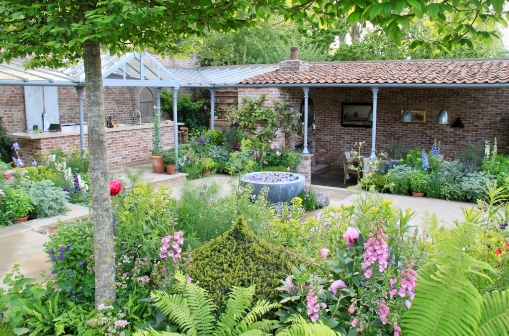
I’ve picked my very favourite first. I adored Mark Gregory’s garden. I tried to discern what I meant by favourite, and it’s the one that drew me back time and again. The garden I most wanted to be in. I’m not convinced it will get Best in Show (perhaps the People’s Choice, although a charity garden may scoop that) as there were a few bits of hard landscaping that didn’t quite sit well, but to me that didn’t matter one bit. I loved the flowery soft planting. I loved the lush vegetable garden. I adored seeing the Chelsea Pensioners in their smart red coats being treated to lunch. And I loved the details everywhere you looked – the paintings on the dining room wall, the petals on the water feature, the old timber door at the back of the working kitchen. It was a happy garden. Relaxed, with nothing to prove. And with a purpose to it, a dynamic, working garden, growing and cooking up a storm. The best for me.
Horatio’s Garden
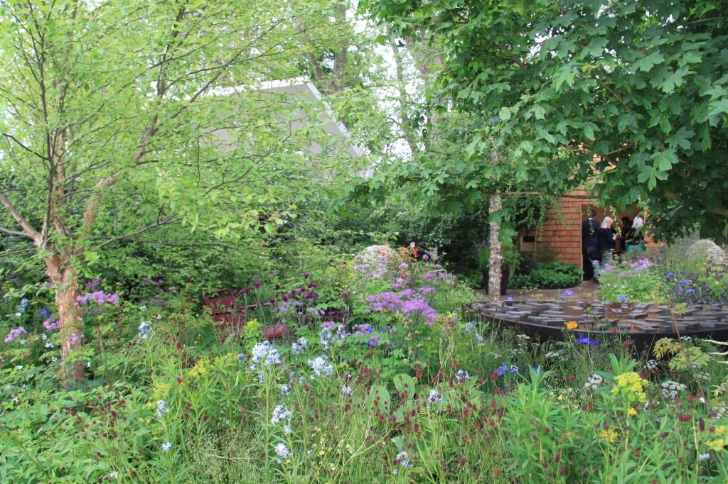
I really wanted to love this one the most. Horatio’s charity is run by a wonderful lady for a wonderful cause: putting world class gardens into NHS hospitals. Harris and Bugg, a talented partnership of designers, have created a very special place here, which will be relocated to a hospital in Sheffield after the show. I think I was partly put off by the solid, wide pathways – it can never be as immersive with these – but they are designed to allow hospital beds to be wheeled out, which is pretty fabulous! The planting was beautiful, with lots of delicate colour, although perhaps nothing we haven’t seen at Chelsea before. In Sheffield, I think I’d give it 11 out of 10. But at Chelsea, perhaps it’s not quite got that innovative, all-consuming edge.
The Nurture Landscapes Garden
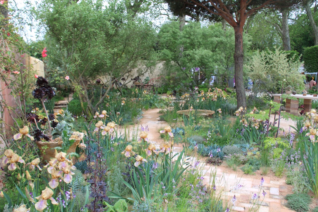
This was the garden I thought I’d like best. Sarah Price, the designer, is exceptionally talented and always on the side of naturalistic that I love. It is brilliantly executed, but just didn’t quite hit the mark for me. I just desperately wanted a few more pops of colour in there. I adore apricot shades but the Benton irises were just a little overly dowdy for me. Beautiful in form, but as I overheard someone say, a little nicotine-y. They were just the shade that my pure white bearded irises go after too long in the rain and therefore felt a little un-fresh-and-Spring-like for me. I loved the looseness of the planting though and the wonderful choice of trees. Technically very good, just not quite to my taste this time.
The Royal Entomological Society Garden
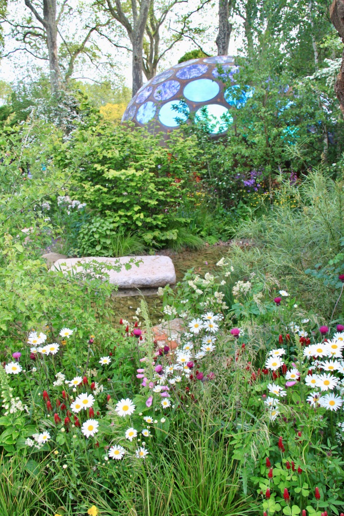
When I saw the artist’s impression for this garden the outdoor laboratory’s structure – based on the eye of an insect – looked totally overwhelming. Yet in real life, it was perfect. A statement, but not outlandish. I loved how Tom Massey had sunken the laboratory a long way down, removing the flatness of the site and I loved the little details in the planting and hard landscaping that made it insect-attracting. It was natural, yet attractive. A clear garden rather than wilderness. And another functioning garden – the laboratory was equipped to study insects and indeed had a class of school children in it this afternoon!
Samaritans’ Listening Garden
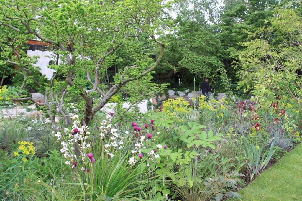
This was a garden of two halves for me. I thought Darren Hawkes’ planting was beautiful: a really good balance of complexity whilst retaining a coherence; a nice mix of colours. A good friend of mine is a Samaritan and hearing her talk about her work gave this garden more meaning for me. It didn’t quite come to the top of the pile: behind where I took this photo had a large quantity of suspended concrete panels (you can just see one on the left). I’m sure they all had deep meaning for someone, but it’s just not what I want to see too much of in a garden.
Myeloma UK – A Life Worth Living Garden
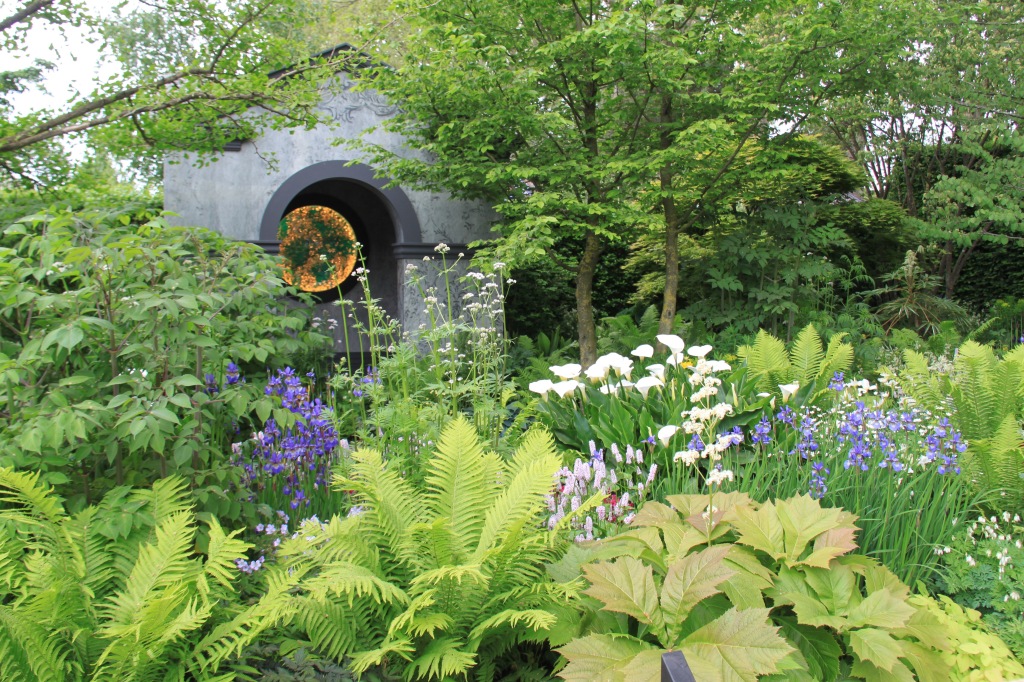
You can spot a Chris Beardshaw garden a mile off and this year’s was no exception. They are beautiful, with really classically designed plantings, but they just look so out of date to me. He always uses large blocks of repeated plants and there is no doubt that they work, but I’ve fallen for the more complex intermingled plantings that we’ve seen for many years now and there’s no going back for me! Chris used outdoor wallpaper inside both ‘buildings’ which was a fun idea, but good as they are, I feel I’ve basically seen his gardens a million times before. Technically good, a really genuinely lovely man, but his Chelsea exhibits unfortunately don’t have the magic for me.
Centrepoint Garden
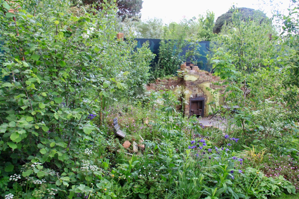
This fell into the Sarah Price category this year: a very clever designer (Cleve West) whose garden I thought I’d love, but it wasn’t quite right, to my eyes. The ruinous house depicted the homeless charity supporting the garden, but I think the planting was just too disjointed. There was much talk in the press of Cleve using dandelions and whilst I’ve actually acquired quite a penchant for the seed heads of these weeds this year and have no problem with them being used at Chelsea, I felt the whole garden was too far along the garden-wild axis. The garden did grow on me over the day as I noticed more and more thought that had gone into it – the peonies and cordylines remaining from the original front garden of the house, for example. It was created by a skilful, knowledgable chap, but I wanted more definition and less ‘random’ growth.
A Letter from a Million Years Past
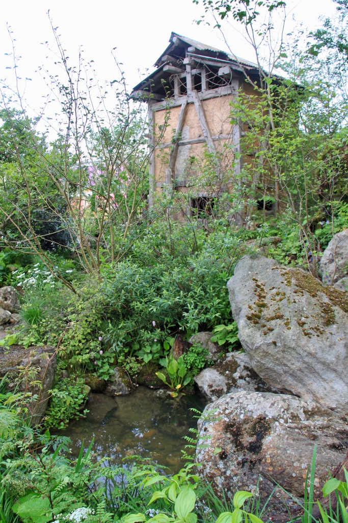
This garden, containing a herb drying tower, was created by a Korean lady, Jihae Huang. There was much of it I adored, including some of my favourite style of planting with a dozen or more species crammed into each small space. I adored the live Korean music played by Koreans in eastern looking dress and the garden very much had a relaxing feel. But the overall lacked a little something to me. The greens a little dull with little contrasting colour to enliven them. They almost looked like they normally look at the end of summer to me – little of the fresh vibrancy you’d expect in Spring. A garden I felt very positively about, but not quite with the punch that Chelsea gardens can offer.
RBC Brewin Dolphin Garden
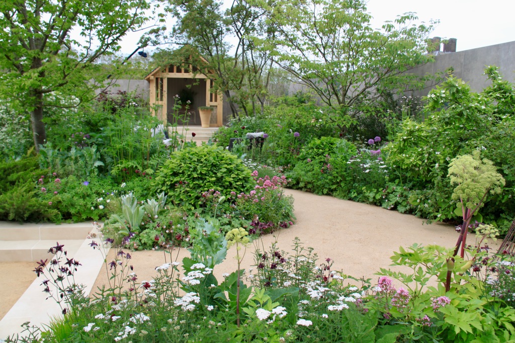
Paul Hervey-Brookes is another designer with a very distinctive style. I first saw his gardens at Hampton Court Flower Show, where he really did steal the show, but at Chelsea I’m looking for new, for innovation, for something a little bit different. He’s similar to Chris Beardshaw in my eyes – a style that works, but that doesn’t excite me. It’s nice, but I look at it and feel I’ve seen it a million times before. It doesn’t hold me or draw me in. I’m pretty fussy when it comes to Chelsea!
Memoria & GreenAcres Transcendence Garden
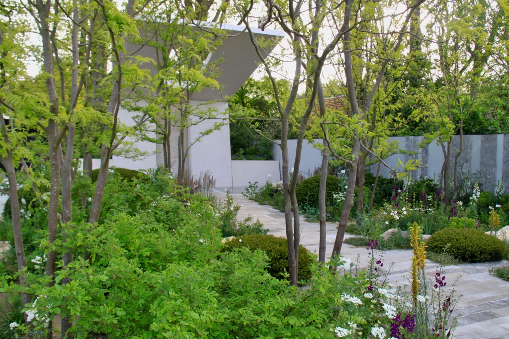
I’m feeling a little overly negative now, but this was another garden designed by very talented designers (Chelsea veterans Gavin McWilliam and Andrew Wilson), but that was totally lost on me. In fact I took around 250 photos on my first walk around the show gardens and was somewhat horrified to find that exactly one was of this one! The cantilevered canopy was designed to be uplifting, but it was stark and out of all proportion to me. And the central path, which I’ve marginalised by the angle of the photo was so wide it felt there was hardly any planting. It was pretty, but sadly a one glance and you feel you’ve seen it garden.
The Fauna and Flora Garden
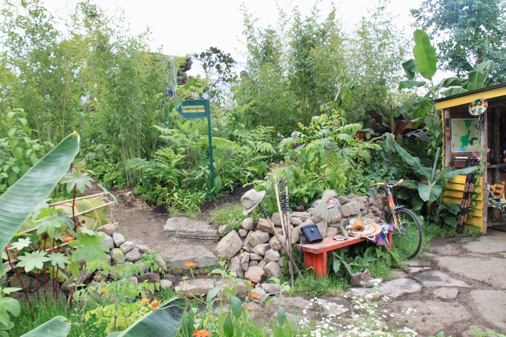
This garden was fun! Jilayne Richards had captured a little piece of Africa in this garden celebrating the International Gorilla Conservation Programme. Enormous leaves of bananas and figs brought such a lushness and the hut and artefacts immediately took you far from London. Some of the planting reminded me of Andy Sturgeon’s previous Chelsea gardens and I tried to put my finger on why Andy’s are solid Gold every time, and this didn’t quite have the same impact. I think it was that definition I mentioned earlier – real contrast in form and colour between neighbouring plants in Andy’s plantings; more of a green blend here. Some wonderfully energetic ideas, but technically not quite up there.
Centre for Mental Health’s The Balance Garden
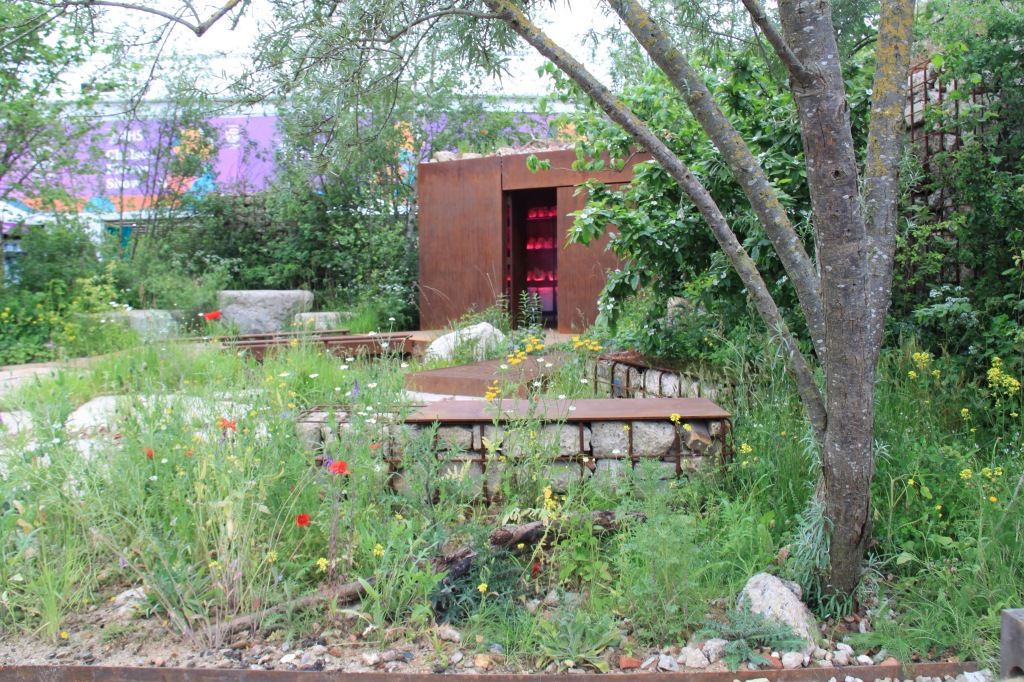
It was unfortunate for Jon Davies and Steve Williams, who designed this garden, that it was located away from Main Avenue and all the other show gardens, resulting in a lack of buzz about the place. They had gone for the wildflower look (weeds included!); flowers which are hard to dislike on an English Spring day. But they were a little sparse for my liking and I found it hard to get past the pink neon lights in the background. I hope they acquire a better site next year and show us what they can really do!
So those are the show gardens. Now I’m longing to know what you think. Are there some I’ve got completely wrong? Which has the magic for you? Have the RHS successfully inspired you? Do let me know!


